Design: Bringing Unity & Flexibility
Great design will be both visually and conceptually harmonious. It’s not rocket science, but on the visual side, the colors, fonts and style used should all work well together. However, having conceptual harmony is a whole other side of the design coin. Design that has strong unity will combine things in a way that brings convenience to the user. That could be convenience in understanding information or convenience in the design’s function.
Maybe that's diving a little deep into design talk, but it’s stuff we’re CONSTANTLY thinking about as we create design. Especially as the designs we build are used across a number of mediums. Logos, storefronts, websites, marketing materials, social media, print pieces, you name it.
We eat, sleep and breathe brand unity and brand flexibility. It’s a must for building a strong cohesive brand.
Grand Marais Art Colony
Our most current project with Grand Marais Art Colony (GMAC) is a perfect example of when we had to meticulously think through how to infuse brand unity and brand flexibility.
It is GMAC’s mission to promote art education and nurture art in the community. To do that, they offer an extensive list of art classes, independent residencies and mentor programs each year. 2021 was no different. The Art Colony's schedule is chalked full of offerings. With all these great programs lined up, we came into the picture to help promote them to art-lovers alike. Again, all in a cohesively way.
Planning
Before we even started thinking through design concepts for GMAC's offerings, though, we first needed to strategize the how. How would GMAC get the word out in the best, most efficient way possible. Through collaboration, it was decided that we'd heavily leverage digital channels to promote GMAC's 2021 offerings. We'd still create a printed mail piece for the Art Colony, but the strong use of digital assets would allow GMAC to expand their reach much further. It also gave them a chance to leverage their various course instructors by creating prepared digital assets for the instructors to post and share with their own groups and followers (be it email, social media, etc.) Brand flexibility, check!
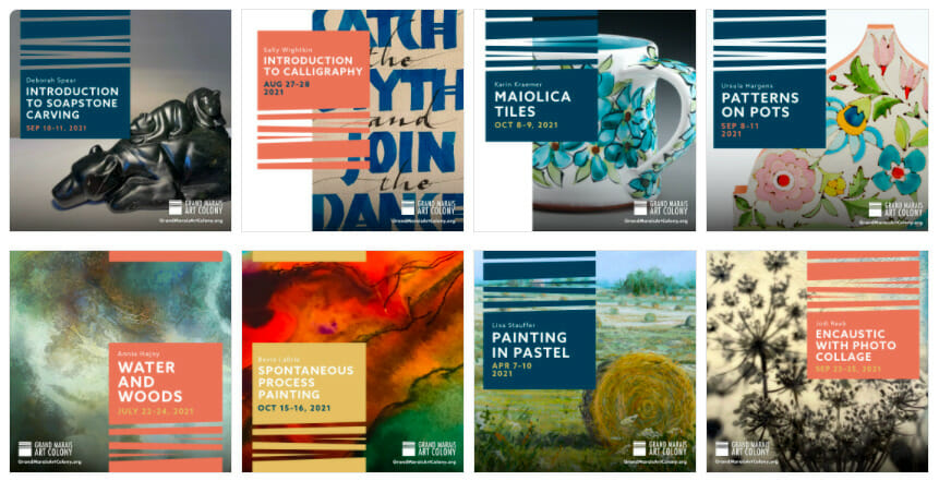
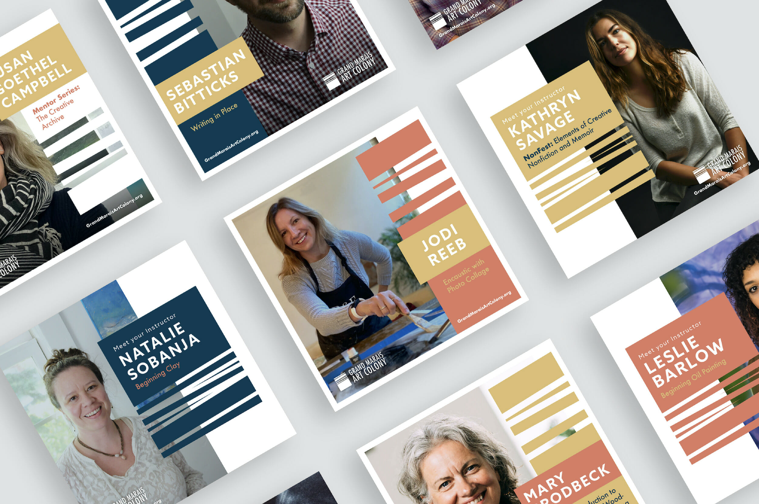
Since the assets would be used by so many instructors, we designed the pieces to be unique to each of them while still having consistent threads. This ensures people familiar with or new to GMAC will see a strongly united campaign.
Brand Flexibility Design
We had gotten the where of promotion nailed down. However, that still left a wide open hole for how to take so many offerings and promote them across various mediums, all while keeping the brand unified and flexible.
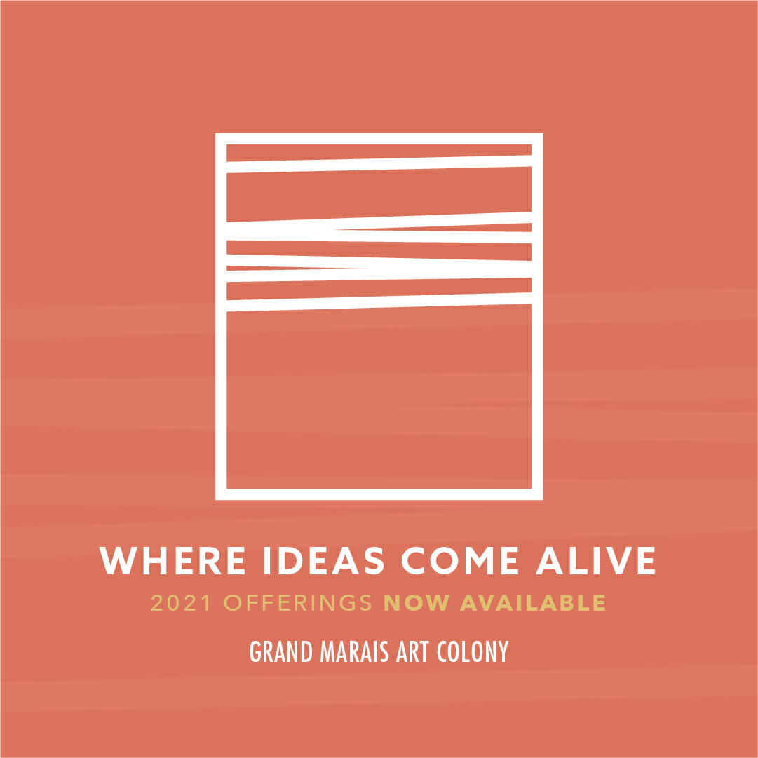
We had a starting place for the design with the Art Colony's yearly theme already decided. They had been going through the natural elements and this year's chosen element/theme was 'fire'. We still, however, had to find that hook that would connect all the assets we'd ultimately create (over 160!) cohesively. We started with the print mailer as it gave us the most real estate to build off of the fire theme. Utilizing large colorful imagery helped us capture the essence of the Colony and all it has to offer. The vibrant images also provide a chance for viewers to picture themselves as a part of the creative GMAC community.
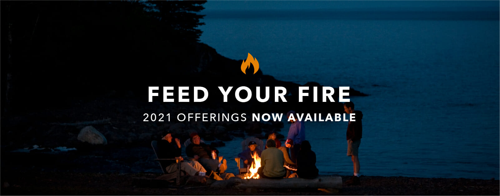
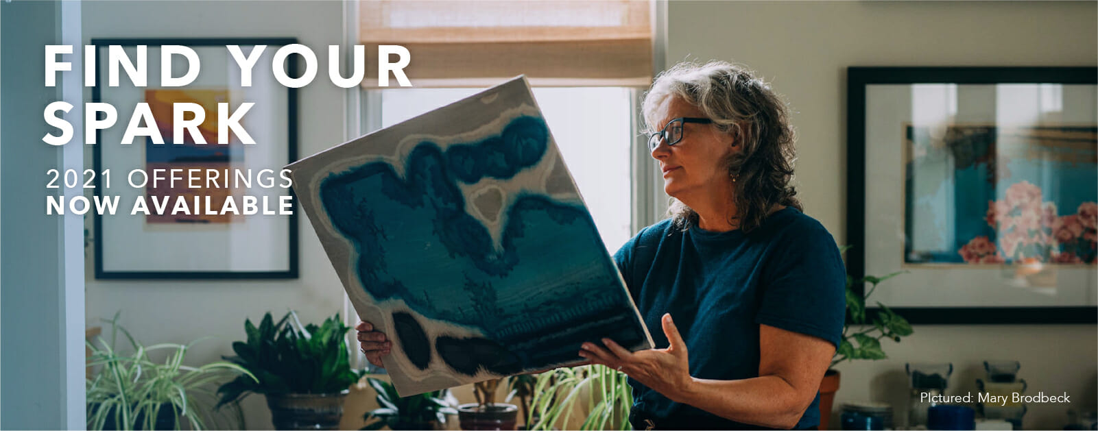
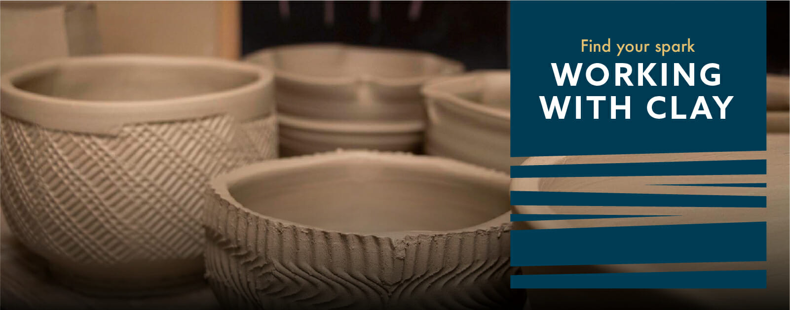
With dedicated spreads for each offering category (entry points, art classes, events, and independent residencies) the piece started to come together. We tied in the theme of fire through inspiring, action-oriented messaging. Headlines like 'feed your fire', 'find your spark' and 'ignite your potential' were all used. Our aim with these, and others, was to encourage readers to dream of expanding their craft.
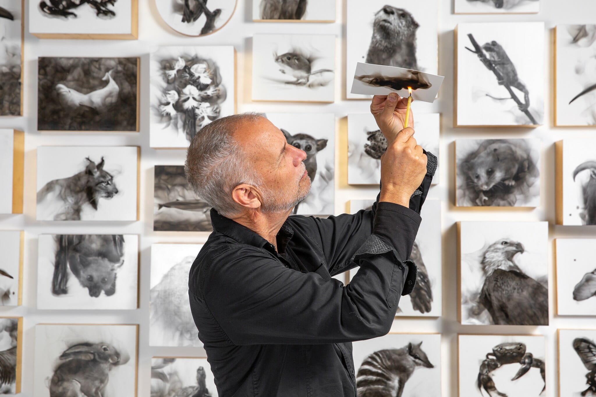
With the mailer in place, we moved on to the numerous digital assets. These consisted of social media images, email headers and website banners. Again, we chose to utilize beautiful photos of artists, their process and their work. However, keeping things uniform was tough to do with the photos varying widely. We also thought it would be extremely boring if everything was cookie cutter. So we had some fun with each pieces and let the photo drive the layout. We still found ways to tie a consistent element throughout, though. Elements like GMAC's logo as a color block overlay and a harmonious color scheme.
How do you think it all came together?
