Visual Communication: What the Heck Is It and Why Should I Care?
We're going to dive right into this one because it's a big topic. Visual communication is the practice of graphically representing information to efficiently and effectively create meaning.
Since that may have many of you thinking, "thanks for the nerdy textbook definition", let's break it down a bit.
Communicating using just words can be hard. When we leverage visuals (pictures, videos, charts, infographics, etc.), we can help avoid confusion and get our full message across clearly and concisely. No fuss. No muss.
Why is Visual Communication Important?
Ever heard the phrase, "a picture is worth a thousand words?" Of course you have. Communicating using visual aids is an extremely impactful way to share an idea or tell a story.
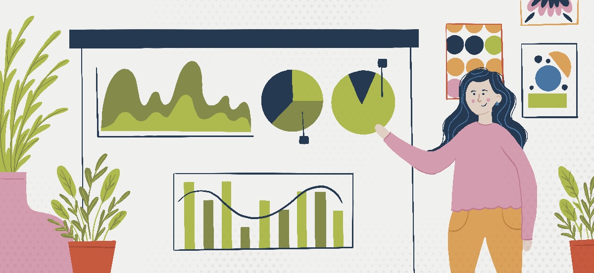
Giving a presentation? We bet you'll put effort into creating some engaging slides to go along with it.
Have to deliver a report? We're sure you'll come up with some nice data visualizations like line and pie charts to help better showcase your findings.
Teaching someone how to play the guitar during a global pandemic? A video sure would go along way in mastering those C and G chords.
Ok, you get the point. Visuals equal a streamlined way to communicate.
What Makes a Good Visual?
Understanding the basic principles of design will help you create effective marketing pieces for your own business, and get your message across clearly to customers or potential customers.
We'll dive into each of these, but the main elements of design that will help increase the impactfulness of your visuals are:
- Shape and Form
- Colors
- Typography
- Layout and Balance
- Contrast
- Space and Movement
Shape and Form
Your brand's shape and form should be intentional. Even when you aren't trying to create a system or make a statement, viewer will form a perception on what it is that you've built. So it's best to 'say' what you intend through thoughtful design. Every piece should have a purpose.
While we understand firsthand the importance of color, it should not define your logo. It's all about its form.
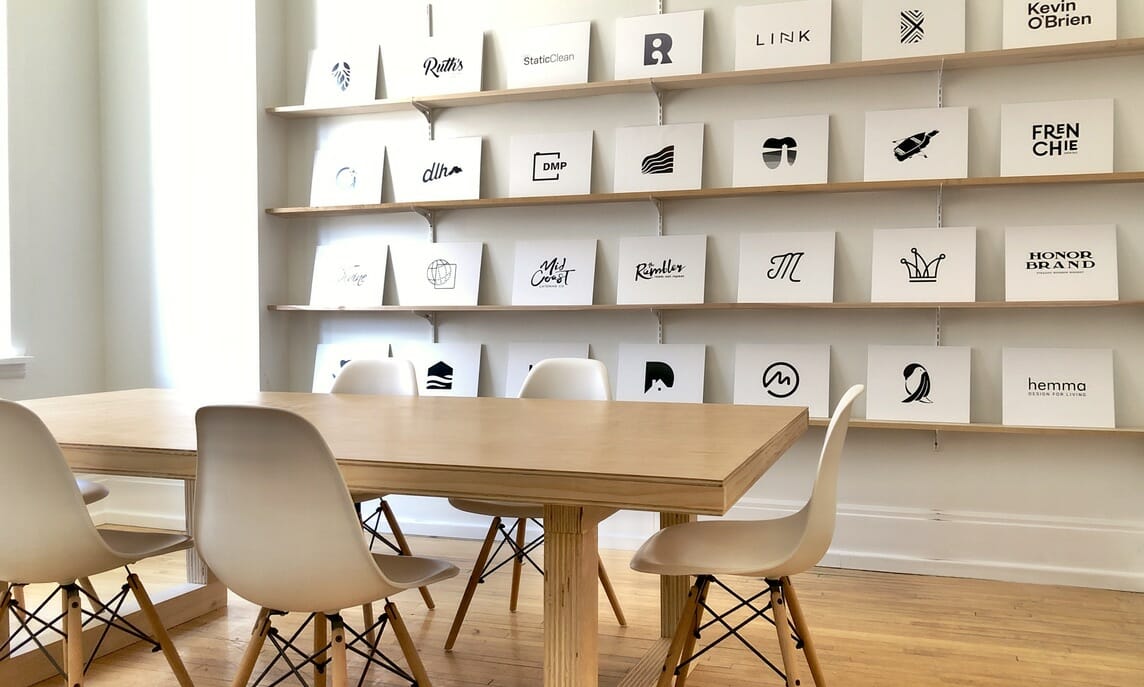
We chose to create an entirely black-and-white logo wall in our studio to drive this point home. It shouldn't matter if your logo is in color not. Onlookers should still be able to see the meaning behind the design and collect clues about what kind of business you are without it being displayed in full color.
These intentional shape and form design decisions will help make your branding memorable. The goal is to be able to have someone draw your logo from memory. That's how impactful form can be.
Color
Ah, colors ... they can be so powerful (especially when paired with good form!)
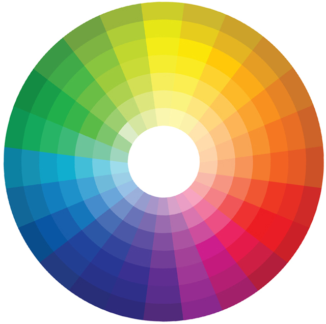
They're the reason behind our love for fall. Blue and orange are direct opposite each other on the color wheel, therefore making these complimentary colors extremely pleasing to our eyes.

A color's superpower lie within its ability to elicit emotion.
A single color has the power to change the mood, energy, and emotion of an image. Which makes them an extremely valuable tool for designers and marketers alike. They can communicate so much meaning!
Without even consciously thinking about it, you mind draws connections when you see specific colors. We often associate red with strength, aggression or love. Yellow makes us think of happiness and warmth. Green is heavily identified with nature and freshness, and blue symbolizes trust, loyalty and competence...
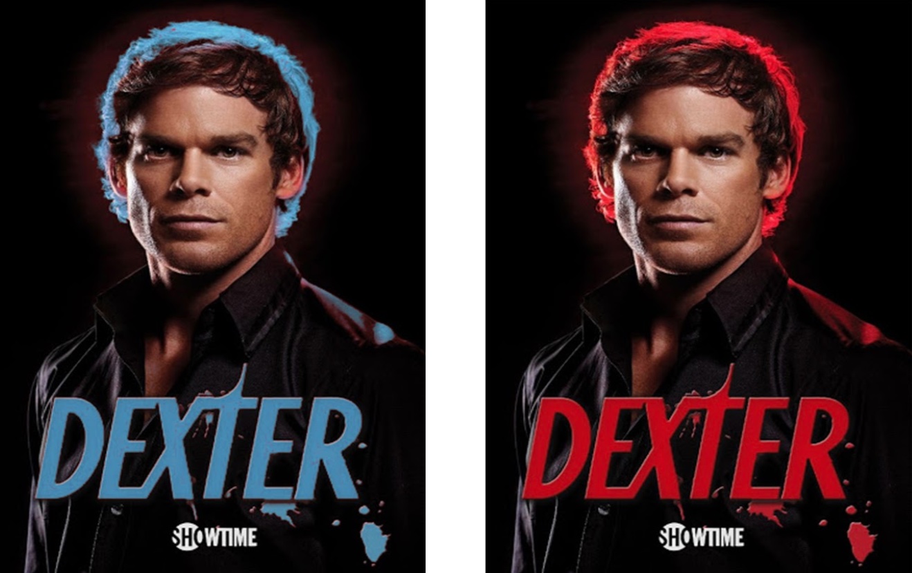
Take the poster below, for example. They both give off a totally different vibe when the only thing that's different is the background spotlight and text color. How do each of these make you feel?
Typography
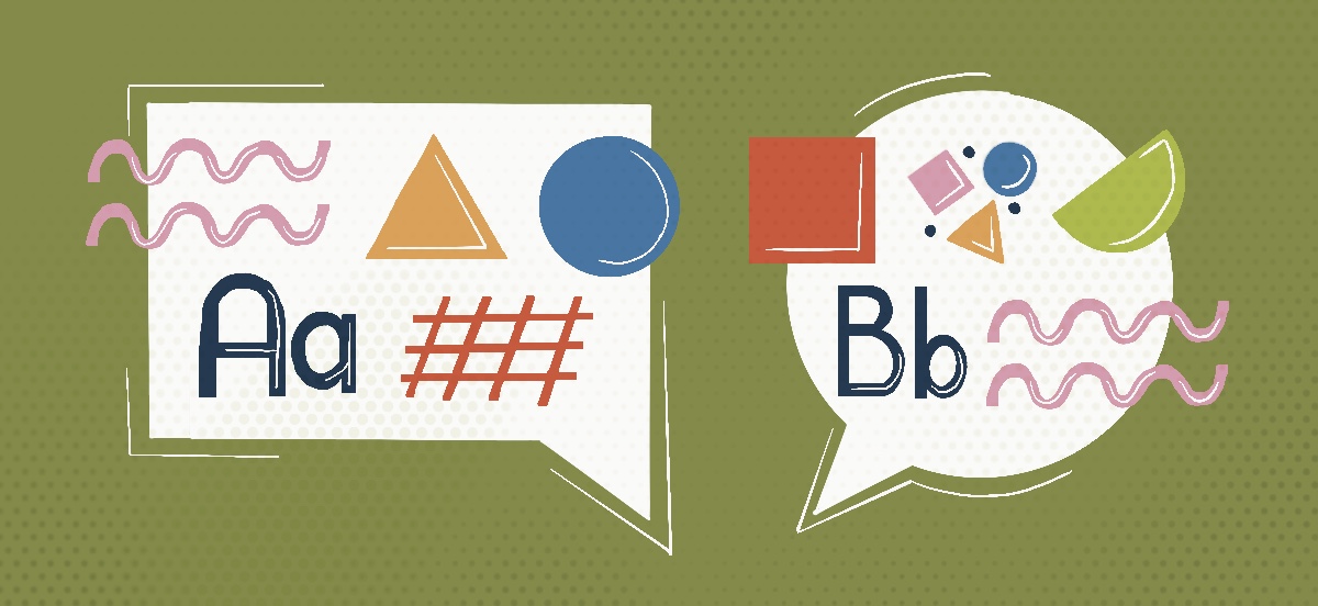
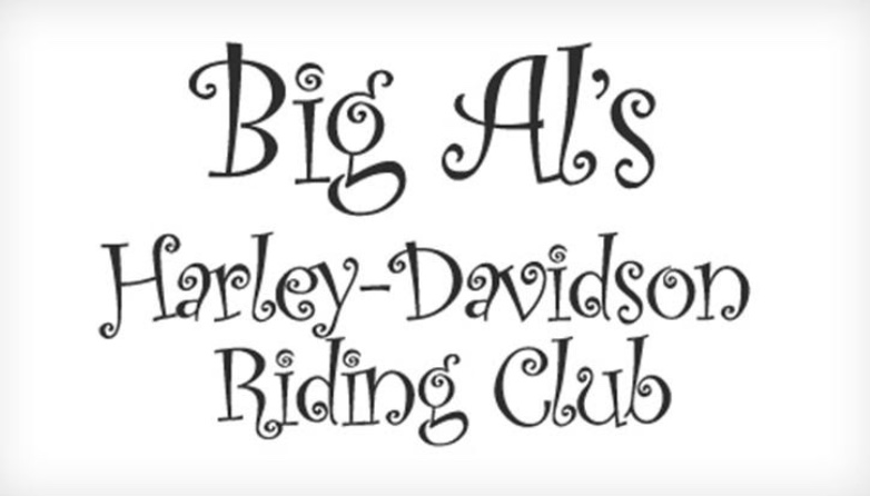
Typography often gets overlooked in terms of importance in design, but this is your friendly reminder that it matters! This is extreme, but take a look at the text to the right. At a quick glance, what kind of business do you think it's promoting?
It's kind of a trick question, right? When you read it, in that specific font, you know something is wrong. A Harley-Davidson riding club doesn't fit with a cutesy, curly typography. Your mind senses a misalignment right away.
So like all the design elements we're covering, be intentional about your typography selection. Think about your message, think about your audience, and align them all in a font that matches the feeling you're trying to get across.
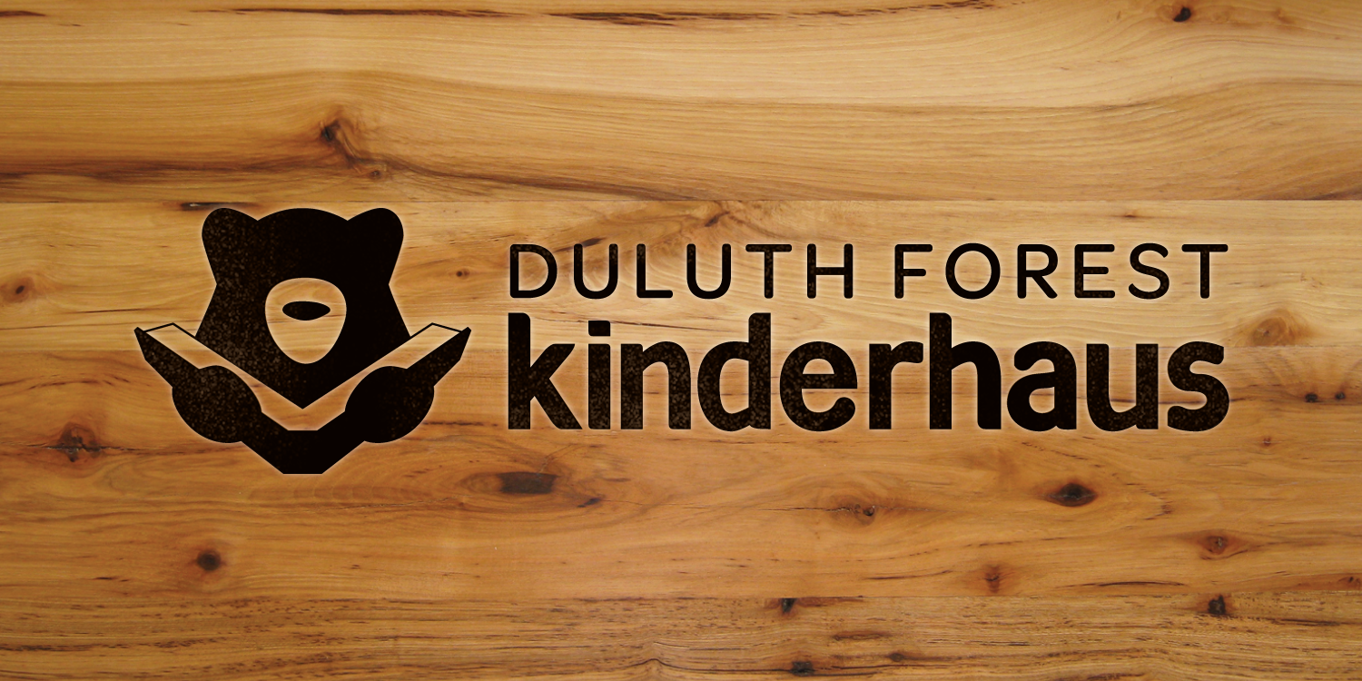
Example time. Duluth Forest Kinderhaus is a preschool that provides learning opportunities through authentic experiences in nature. The audience for their brand and marketing materials? Parents and caregivers of young kids.
With the brand's audience at the forefront, we made the decision to keep their font lowercase for more of a simple, approachable feel. The typography has rounded edges in alignment with the brand icon we created, bringing even more softness to the text. Think of how different the feel would be if it were ultra bold and in all caps.

Layout and Balance
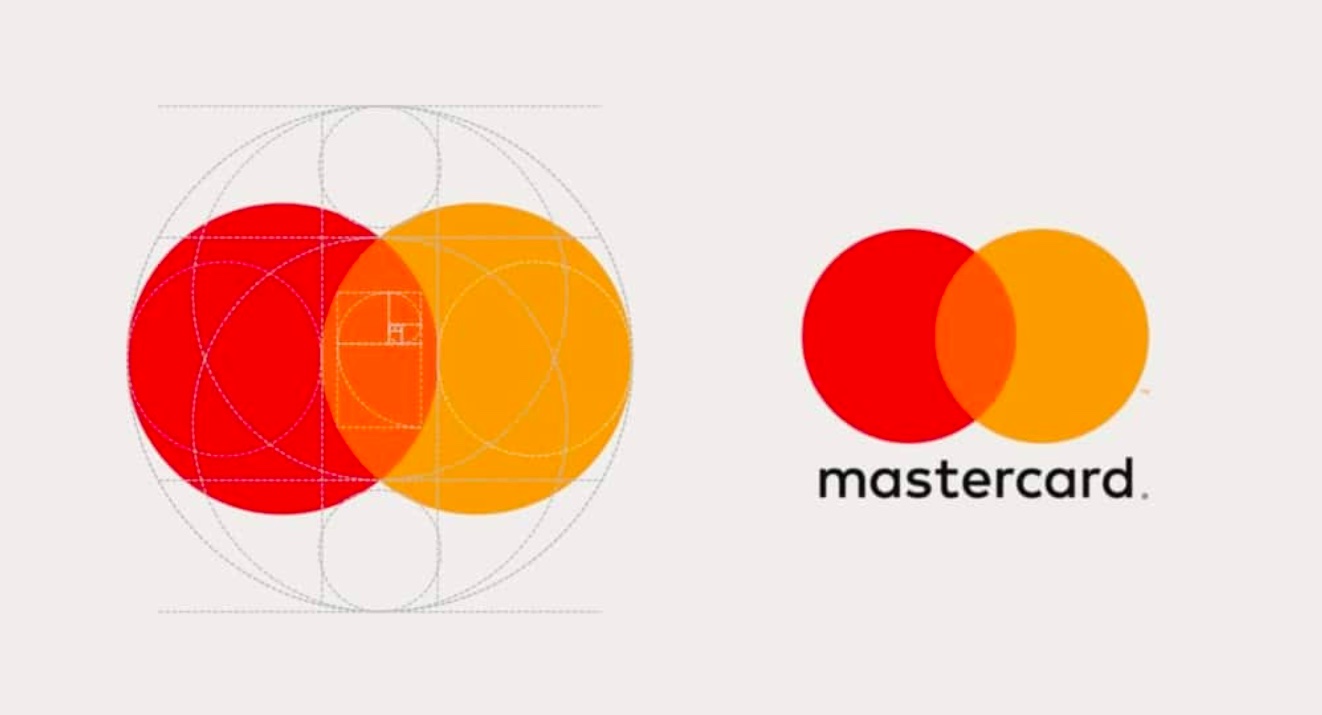
Many logos are built using a blueprint grid which creates a ‘playbook’ that the rest of the brand can play off of. Spacing, angles, and radius all play a part in creating the communication elements that eventually become recognizable to a brand’s followers.
When working with your brand, make sure you have a plan for elements that will be used for a wide variety of mediums. Proportion and scale are key here, folks.
Once these pieces are determined, capture them in a brand guideline so the spacing, proportions and angles are always used consistently no matter who is implementing your brand. These guidelines are what keeps us from seeing oval-shaped Mastercard circles out in the world.
Contrast
The word ‘contrast’ applies to so many things in the world of design. At the most basic level, it refers to the ability for one thing to stand apart from another. Black doesn’t exist without the reference of white. This goes for everything in life. We can always appreciate something more if we’ve experienced the opposing emotion.
If a piece has no visual contrast it effectively renders itself ‘grey’ by being too noisy.

Space and Movement
In building your design, you’re responsible for leading the viewer’s eye to see what you want them to see. For each marketing piece, think through what you'd like them to see first, second and third. What are the main points you want to make sure they take away? Intentionally utilizing the space available for your design will maximize the impact it has.
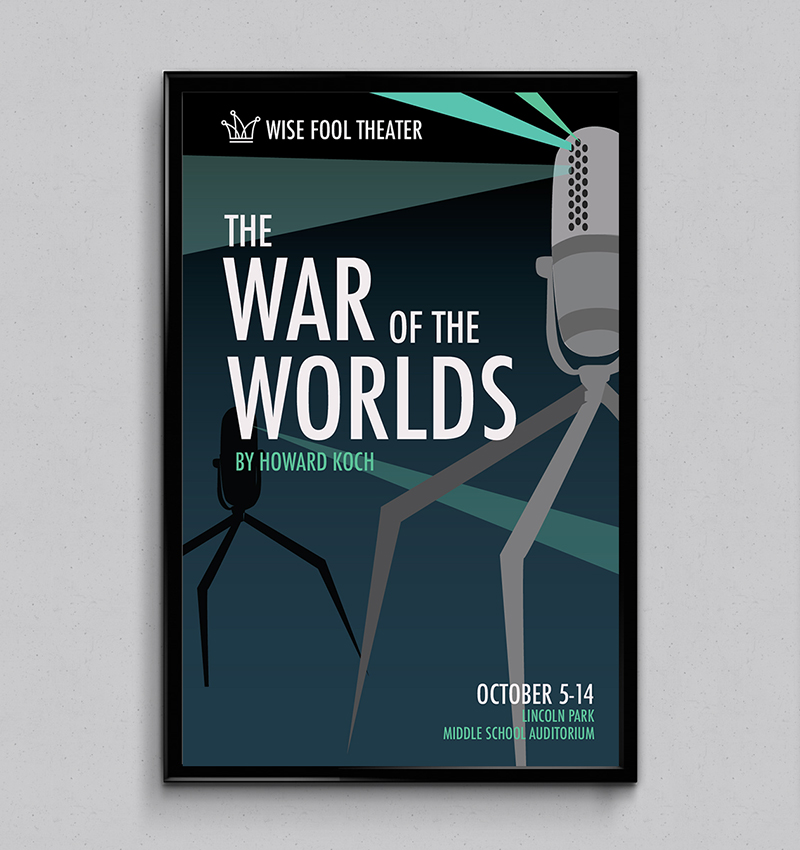
Take the Wise Fool Theater show poster below. When you look at it, the show's title, 'The War of the Worlds,' likely captures your attention first. The large image of the microphone in the foreground is probably a close second. From there, the light beams aren't just for show. They strategically bring your eye to the theater's logo as well as down to the bottom where further event details are listed. And the path doesn't end there. The October date laid over the microphone's leg draws you back up once more. Keeping you in a cycle of deeper viewing—all subconsciously!
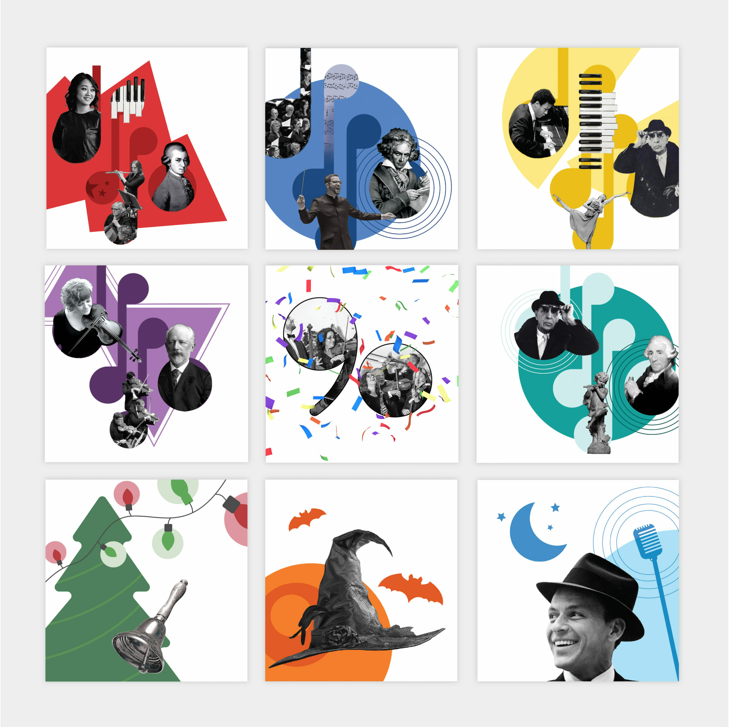
The Duluth Superior Symphony Orchestra graphics below also showcase the power design can have in bringing movement and interest to a piece. Each square, or featured musical number in this case, has a lot going on. They're not overly 'busy,' though. Each brings the feelings of the individual scores as well as nods to the composer, featured instruments and notable pieces from the song's story. It all builds a greater understanding of the piece before you even hear thee first note.
Your Turn
Now that you're a pro in visual communication, how will you leverage the main design elements to create new forms of communication to benefit your business?
We'll leave you with a final tip. If you get overwhelmed just thinking about it all, try to pick at least one of these design elements to focus on. Dropping us a line is always an option too if all this design talk makes you want to throw your arms up. We live and breathe design mumbo jumbo and are happy to help if you feel stuck.
