
LSYC | Logo Redesign & 2022-'23 Program Book
Lake Superior Youth Chorus
Arts & Entertainment
What We Made
Logo Design
Marketing Collateral
Event Promotion
Tags
superior
youth
Challenge
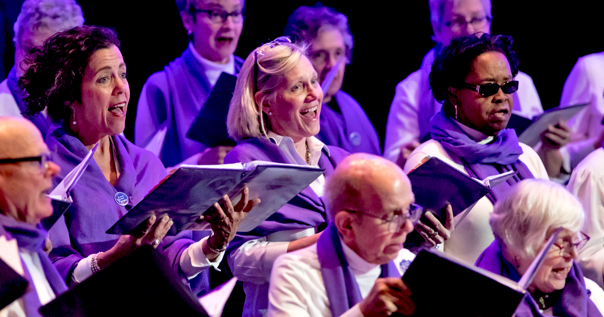
The Lake Superior Youth Chorus team had two big projects they came to us with in 2022. First was for their 2022-2023 program book design (or what they internally call their season viewbook). This 45 page booklet is the season's to-go document. It houses information about Lake Superior Youth Chorus. The LSYC staff and board of directors, the various choirs and the signers, and of course, the sponsors that support LSYC's vision. It's a lot of great information. The challenge with the program book's design is visually showcasing all of that information in a digestible and engaging way. Project number two from LSYC was redesigning their logo. The past logo wasn't bad, per say, but it lacked the flexibility that LSYC would like to have. They wanted a logo they could more easily use across their different promotional materials.
Concept
Tackling the logo first, we approached this as a logo refresh instead of a full logo redesign. Their brand is already established in the community and there wasn't an appetite for a full rebrand, so instead we kept the changes subtle but impactful. The final updated logo design utilized the same treble clef that the organization is known for. However, instead of containing the LSYC logo within a circle, we only contained the treble clef in the new brand system. This small change massively opened up the brand's flexibility.
Outcome
Using the new format, we built out horizontal, stack and icon versions of the logo. All in different color combinations: full color with LSYC's blues and orange, just a single blue, black and white, you get the idea. All of these different variations, set up the LSYC team to have anything they would need going forward so the brand could be well-represented within any allotted space. For the program book, or season viewbook, the main feat was organization. We developed thoughtful solutions for displaying the information the in an approachable way that was easy to navigate through. We created custom graphic pieces to help with this, and of course, utilized it as an avenue to showcase the new logo design.
Challenge
The Lake Superior Youth Chorus team had two big projects they came to us with in 2022. First was for their 2022-2023 program book design (or what they internally call their season viewbook). This 45 page booklet is the season's to-go document. It houses information about Lake Superior Youth Chorus. The LSYC staff and board of directors, the various choirs and the signers, and of course, the sponsors that support LSYC's vision. It's a lot of great information. The challenge with the program book's design is visually showcasing all of that information in a digestible and engaging way.Project number two from LSYC was redesigning their logo. The past logo wasn't bad, per say, but it lacked the flexibility that LSYC would like to have. They wanted a logo they could more easily use across their different promotional materials.
Solution: Logo Design & Season Viewbook
Tackling the logo first, we approached this as a logo refresh instead of a full logo redesign. Their brand is already established in the community and there wasn't an appetite for a full rebrand, so instead we kept the changes subtle but impactful. The final updated logo design utilized the same treble clef that the organization is known for. However, instead of containing the LSYC logo within a circle, we only contained the treble clef in the new brand system. This small change massively opened up the brand's flexibility.Using the new format, we built out horizontal, stack and icon versions of the logo. All in different color combinations: full color with LSYC's blues and orange, just a single blue, black and white,ou get the idea. All of these different variations, set up the LSYC team to have anything they would need going forward so the brand could be well-represented within any allotted space.For the program book, or season viewbook, the main feat was organization. We developed thoughtful solutions for displaying the information the in an approachable way that was easy to navigate through. We created custom graphic pieces to help with this, and of course, utilized it as an avenue to showcase the new logo design.
Want to See More LSYC?
This isn't our first go-around with the Lake Superior Youth Chorus. We partnered together initially on their 2021-2022 season viewbook design. Take a peak at how the program books differ between the new and old logos.


What they said and how they felt
More of what we have made
Victory Chorus

The Duluth Experience
