

Great Lakes Sober Living
Great Lakes Sober Living
Home & Living
What We Made
Tags
brochure
business cards
glsl
great lakes
logo
pamphlet
sober house
tagline
website
Challenge
A lot is involved in developing a brand to succinctly tell an organization's story. It takes truly understanding the business' mission and its customers' needs. Keeping both in mind, we worked with Great Lakes Sober Living (GLSL) to help present who they are in a way that speaks directly to the individuals they serve.
Concept
GLSL offers safe and supportive environments for people looking to maintain long term sobriety. As such, we created a brand identity that captures a calm, peaceful feeling GLSL's residents are looking to achieve.
Outcome
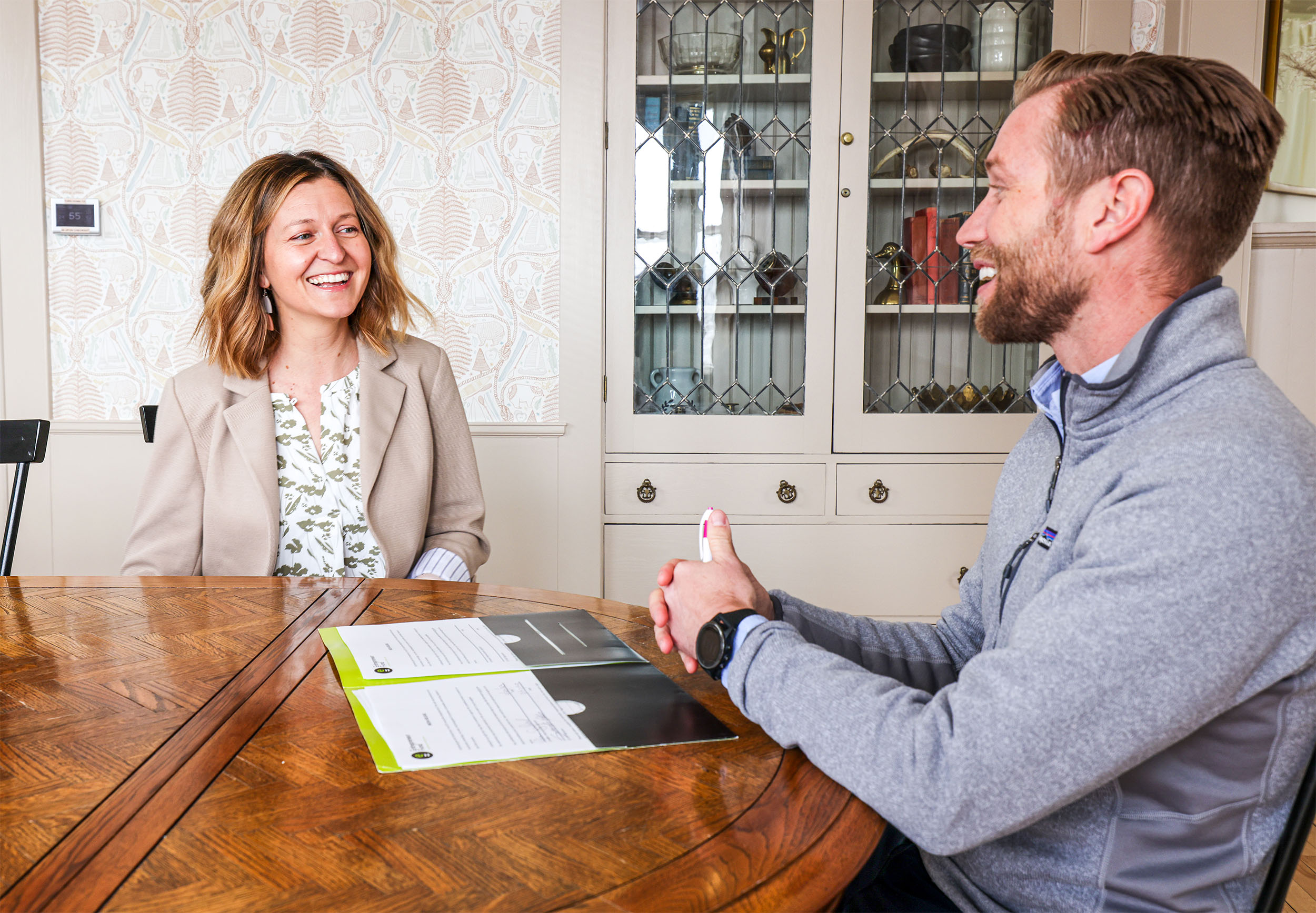
The logo's house shape was designed to clue viewers into what GLSL provides, while the wave lines tie into GLSL's name and location. How Lake Superior was blended into the brand, however, was given great consideration. With many companies in the area touting ties to the lake, we took care to ensure that GLSL would stand apart. The wave lines were methodically designed to signify progress — visualizing the steps individuals take in their journey to sobriety. This element was incorporated throughout the logo, business cards, brochure, website, as well as other brand pieces. Take a look through the elements below to see how we helped Great Lakes Sober Living tell their story through design.
A lot is involved in developing a brand to succinctly tell an organization's story. It takes truly understanding the business' mission and its customers' needs. Keeping both in mind, we worked with Great Lakes Sober Living (GLSL) to help present who they are in a way that speaks directly to the individuals they serve. GLSL offers safe and supportive environments for people looking to maintain long term sobriety. As such, we created a brand identity that captures a calm, peaceful feeling GLSL's residents are looking to achieve.The logo's house shape was designed to clue viewers into what GLSL provides, while the wave lines tie into GLSL's name and location. How Lake Superior was blended into the brand, however, was given great consideration. With many companies in the area touting ties to the lake, we took care to ensure that GLSL would stand apart.The wave lines were methodically designed to signify progress — visualizing the steps individuals take in their journey to sobriety. This element was incorporated throughout the logo, business cards, brochure, website, as well as other brand pieces.Take a look through the elements below to see how we helped Great Lakes Sober Living tell their story through design.


What they said and how they felt
More of what we have made
Entrepreneur Fund | Brand Refresh & Website Redesign

UW-Superior Link Center
