Duluth Playhouse | Rebrand + 2022-23 Season
Duluth Playhouse
Arts & Entertainment
What We Made
Branding Identity
Brand Guidelines
Logo Design
Marketing Collateral
UX & Website Design
Website Development
API & Platform Integration
Tags
season
show
theatre
Challenge
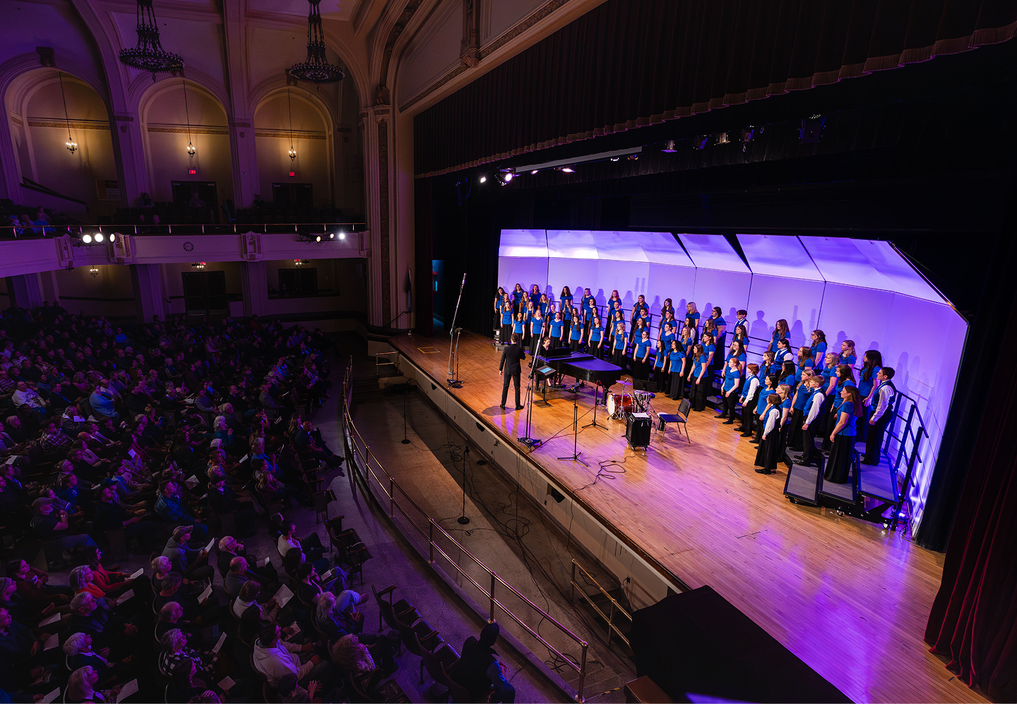
We've had the pleasure of working with the Duluth Playhouse for a number of years now. But 2022 was an extra special year. With the vision to break away from being seen as just a small community theater, the need for a complete rebrand was born. The big challenge in this was bringing a level of sophistication to the brand while not alienating the local Duluth community the theatre was born out of. In addition to rebrand, the Playhouse also needed help building out graphics for the 2022-'23 season's various performances. The show (er, shows) must go on after all — rebrand or no rebrand!
Concept
We knew a lot about the Playhouse already, but to fully immerse ourselves in the organization, we dug even deeper into the organization history and who the theatre is today. After which, we worked with the Playhouse team to solidify their mission and vision to create opportunities in theatrical arts that educate, entertain, and engage the twin ports community, while opening doors to theater to promote growth in one’s self and our neighbors.
Outcome
The rebrand took shape across not only the Playhouse's logo, but also in their program books, storefront windows, social media, as well as their website. The website's design and development focused on creating a seamless experience for users through an engaging design with intuitive functionality. Since the launch of the site, the Duluth Playhouse has been selling out shows faster than ever and has even had the opportunity to add additional shows. A first in the organization's history!
Challenge
We've had the pleasure of working with the Duluth Playhouse for a number of years now. But this year was extra special. With the vision to break away from being seen as just a small community theater, the need for a complete rebrand was born. The goal of the theatre's rebrand was to showcase the organization as a top tier theatre in the region that pulls highly regarded talent from all over. The big challenge in this was bringing a level of sophistication to the brand while not alienating the local Duluth community the theatre was born out of.In addition to rebrand, the Playhouse also needed help building out graphics for the 2022-'23 season's various performances. The show (er, shows) must go on after all — rebrand or no rebrand!
Solution
Despite working with the Playhouse for the past several years, we didn't skip our first step in the branding process. Discovery. We knew a lot about the Playhouse already, but to fully immerse ourselves in the organization, we dug even deeper into the organization history and who the theatre is today. After which, we worked with the Playhouse team to solidify their mission and vision.
- Mission: To create opportunities in theatrical arts that educate, entertain, and engage the twin ports community.
- Vision: Opening doors to theater to promote growth in one’s self and our neighbors.
We kept both at the forefront of our minds while concepting theatre rebrand designs. We ultimately landed on the logo you see below. It blends a modern/bold typeface, intersecting stage lights meant to resemble collaboration, and vibrant and expressive stage lighting colors.We built out the logo in a number of flexible variation. Full horizontal, a stacked version, and an icon. Additional variations were also created using each of the Playhouse's new brand colors: electric blue, encore red, and showtime teal.
More Show-Stopping Work
See the directions that have been taken for past Duluth Playhouse season artwork.

Lights, Camera, Rebrand
The new logo blends a modern/bold typeface, intersecting stage lights meant to resemble collaboration, and vibrant and expressive stage lighting colors. We built out the logo in a number of flexible variation. Full horizontal, a stacked version, and an icon. Additional variations were also created using each of the Playhouse's new brand colors: electric blue, encore red, and showtime teal.


What they said and how they felt


What they said and how they felt

What they said and how they felt
The 2022-23 Season
The shows within the Duluth Playhouse's 2022-'23 season needed engaging artwork to represent each of them. This artwork had to be flexible as it's used to showcase each show across the Playhouse's various marketing channels, posters, social media, mailers, and the like. Each piece of show artwork we created was clean but engaging. They each contained nods to elements within their particular story without overcrowding the piece. While each show artwork was unique to its respective show, we developed all the pieces to fit together collectively as one season using common themes through each piece of show artwork.


What they said and how they felt


What they said and how they felt


What they said and how they felt


What they said and how they felt
Website Launch
We developed a dynamic website for Duluth Playhouse using Webflow, ensuring a seamless user experience and modern design. Through close collaboration, we integrated their mission of promoting theatrical arts and community engagement into the website's structure and content. The result is a visually captivating platform that reflects the Playhouse's vibrant identity and gives users the confidence to order show tickets again and again. Additionally, the improved functionality and user-experience helped lead to shows selling out faster than ever better! The Playhouse staff even had the first opportunity to add additional showtimes based on the ticket sale data the site provided.

What they said and how they felt

What they said and how they felt

What they said and how they felt

What they said and how they felt


What they said and how they felt
More of what we have made

National Bank of Commerce

Barker's Island Marina