Embark Supported Employment
Embark Supported Employment
Non Profits
What We Made
Branding Identity
Brand Guidelines
Design
Interior & Exterior Store Design
Logo Design
Marketing Collateral
Naming
Tags
apparel
business card
digital
embark
employment
logo
naming
non profit
shirt
sign
signage
superior
tagline
vocation
yard sign
Challenge
Branding for non-profits is a fun challenge, as their mission-driven focus brings passion to storytelling. But creating comprehensive branding for any business is no easy task, with many elements to consider, from name selection to messaging and logo design. These components must not only tell the organization's story but also set it apart from others and resonate with the target audience.
Our work with Superior Vocations Center (SVC), a non-profit in Northern Wisconsin supporting individuals with disabilities, began with a brand refresh. Despite their impactful work, SVC's name and branding didn't clearly communicate their mission. Through meetings with SVC's leaders and team members, we learned about their values, whom they serve, and their goals. With this knowledge, we set out to create a new brand identity that truly encapsulated SVC's spirit and story.
Concept
First up on our to-do list was to evaluate the Center's name. After hours of research and more collaborating, we aligned on pivoting the organization to the new name: 'Embark Supported Employment'. One of our goals with the new name was to really highlight what the center provides — supported employment. Our other goal was to infuse the name with a unique and aspirational focus to speak to the group they serve and their journey with employment.
Outcome
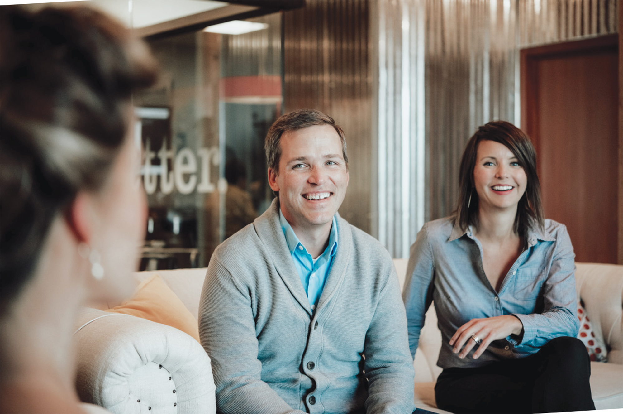
With their new name in place, we set forth to concept Embark's new brand. Like their name, we wanted their brand to exude hope and a feeling of being lifted up. And that's exactly where the idea of the leaf came into play. We see Embark's clients soaring off on their own and shinning bright.The colors of Embark Supported Employment are warm and inviting to bring an approachable aspect to the brand. Together, the orange, red, pink and navy all work together to create a bold and recognizable look. We chose a font that compliments the soft features of the logo, while also having its own robustness to create a strong base for headlines and Embark's wordmark. Embark's imagery is based on raw and real photos of their team. They aim to show what a real work environment looks like and the smile that comes along with it for their clients. We designed many promotional images to include an orange gradient overlay with the white tagline and horizontal logo to bring a freshness to the photo and consistent recognition to the brand.
As story-tellers, we love doing branding work for non-profits. Their mission-driven efforts and passion for the work they do make telling their story a fun challenge. Don't gloss over that last part, though. Creating all-encompassing, organizational branding for any business is no small feat. There is still a lot to consider. Name selection, brand concept, logo design, messaging, just to name a few. And all of these pieces not only need to tell the organization's story, but they also need to differentiate it from other companies and connect with the organization's intended audience. (Did I mention it's a lot?)
Superior Vocation Center
This organizational branding story starts with the Superior Vocations Center. They are a private non-profit corporation that creates opportunities for meaningful employment and community engagement for individuals with disabilities in Northern Wisconsin. They serve a true community need but felt their name and branding didn't clearly explain who they are or what they do.Enter Šek.Throughout meetings with Superior Vocation Center, we got to hear from organization's leaders as well as its team members. They shared the story of the organization, its values, who and how they serve those they help, and much more. From all our learnings, we were ready to hit the ground running to develop new organizational branding that would encompass them as a whole.
Embark Supported Employment
First up on our to-do list was to evaluate the Center's name. After hours of research and more collaborating, we aligned on pivoting the organization to the new name: 'Embark Supported Employment'. One of our goals with the new name was to really highlight what the center provides — supported employment. Our other goal was to infuse the name with a unique and aspirational focus to speak to the group they serve and their journey with employment.
Organizational Branding
With their new name in place, we set forth to concept Embark's new brand. Like their name, we wanted their brand to exude hope and a feeling of being lifted up. And that's exactly where the idea of the leaf came into play. We see Embark's clients soaring off on their own and shinning bright.The colors of Embark Supported Employment are warm and inviting to bring an approachable aspect to the brand. Together, the orange, red, pink and navy all work together to create a bold and recognizable look. We chose a font that compliments the soft features of the logo, while also having its own robustness to create a strong base for headlines and Embark's wordmark.Embark's imagery is based on raw and real photos of their team. They aim to show what a real work environment looks like and the smile that comes along with it for their clients. We designed many promotional images to include an orange gradient overlay with the white tagline and horizontal logo to bring a freshness to the photo and consistent recognition to the brand.
More Examples
To see just a few examples of non-profit branding we've done, check out any of the following projects:


What they said and how they felt
More of what we have made

Divine Destinations

Salmela


