RE/Max Results | Kevin Kalligher
As a professional it’s important — no, essential — to be able to present the unique strengths you have. Doing so showcases how you’re different from your competitors. It help explains who you are and why customers should choose to do business with you.
In talking with Kevin Kalligher, real estate expert with RE/Max Results, we quickly learned that he has a lot of unique strengths that play a big roll in getting buyers into their dream home. For potential buyers that have not had a chance to talk with Kevin, however, we want to make sure all those great differentiating qualities still come through.
So how do you highlight what makes you unique when you’re not in the room?
Through branding.
We got the chance to take on creating a new brand for Kevin and took the opportunity to make his professional brand as unique as he is.
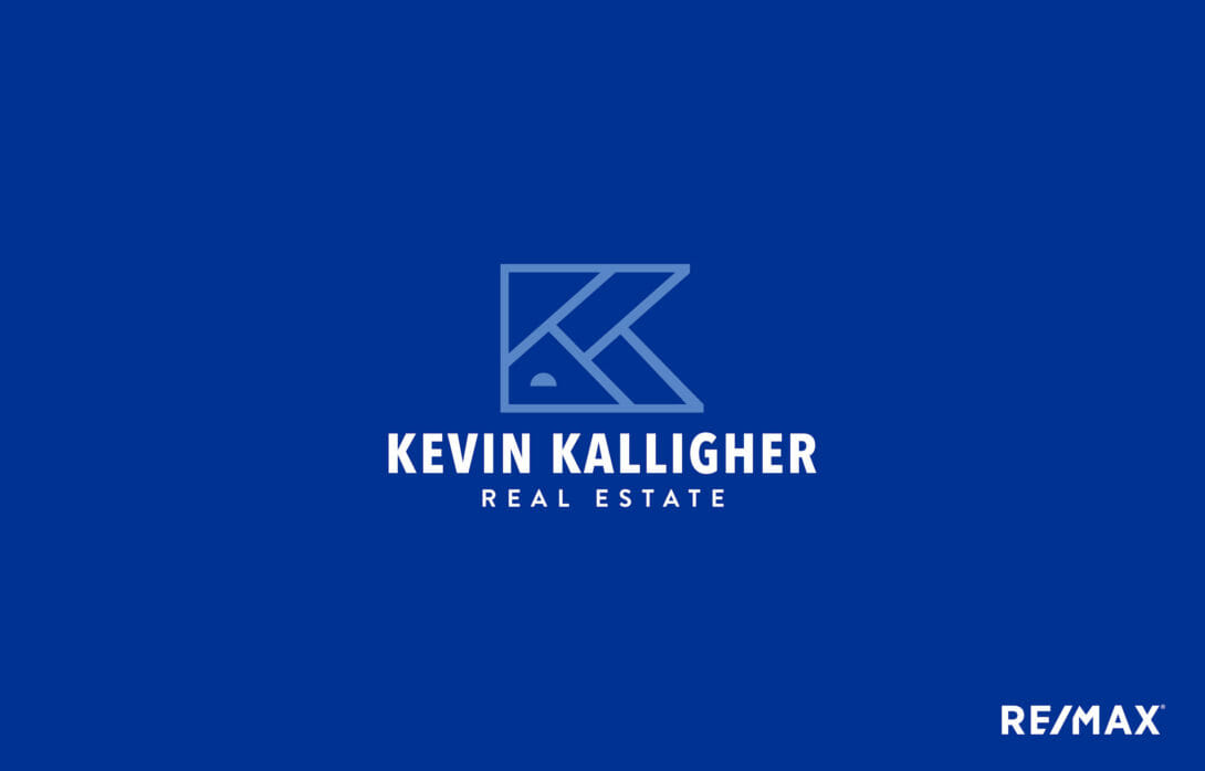
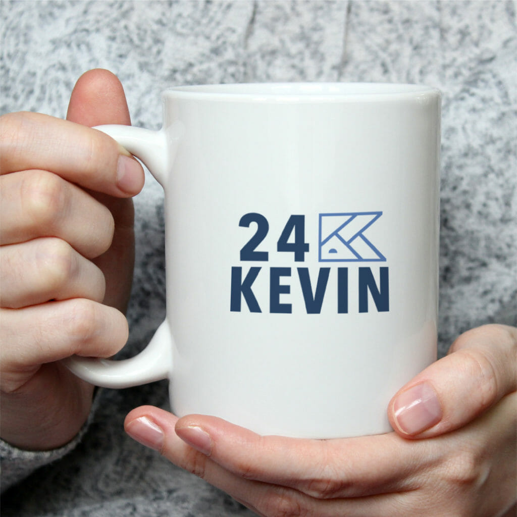
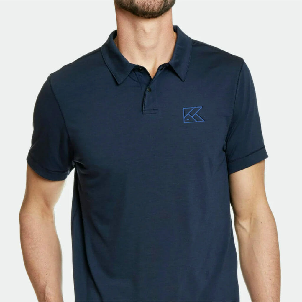
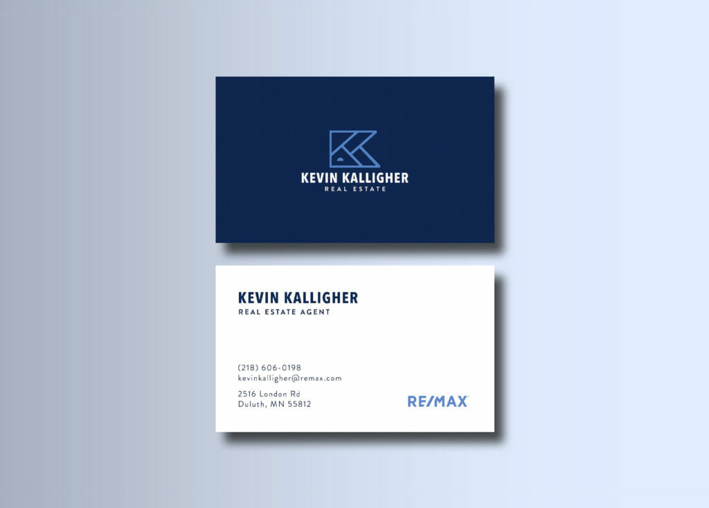
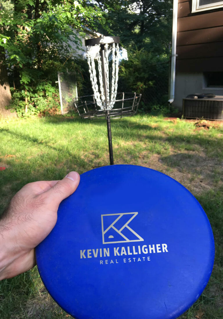
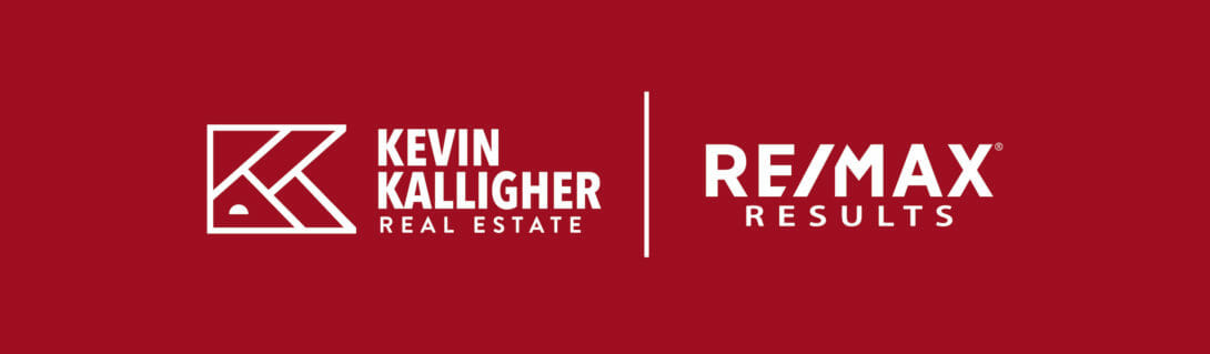
We kept the design direction modern and untraditional — steering clear of overused house outlines, front doors and keys. The line work in Kevin’s logo represents the two Ks in his name and the rooflines of homes. The intersecting lines are also meant to symbolize Duluth’s street grid – the city Kevin mainly works in. Lastly, similar angles were used to align with the angle of the “/” found in RE/Max Results’ branding.
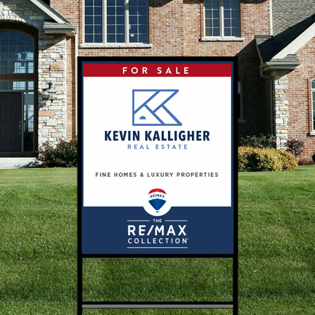
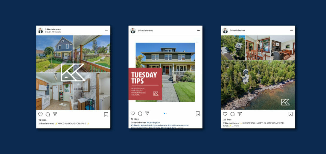
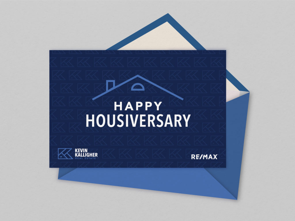
Special consideration was taken to ensure Kevin’s professional branding works nicely with RE/Max’s logo as they may often be used together. However, Kevin’s individual branding has its own strength so it can stand strong on its own. Whether on a yard sign, business cards or more subtly through social media posts.
To view more identity work that has helped elevate professional brands for all sorts of clients, visit our work page.