Frenchie Cocktail | Behind The Design
INTRODUCTION
It’s 5:20 on a Wednesday afternoon, Thunderstruck is blaring over the speakers inside the gym, and I’m just about to start my second set of dead-lifts when I have to stop myself from laughing out loud. Here’s what happened. I just imagined what all of these mostly macho classmates would think if they knew that just two hours earlier, the 220-pound guy next to them had spent the majority of his day painting delicate, pastel images of a cute French bulldog. Eventually, I complete my final set and as I walk my way to the water fountain I think, “I should try another version where François beret is a little more tilted. Yeah – that’ll be perfect!” Anyone who knows me knows that I’m constantly thinking about my work. For most creative professionals, their work is a big part of their identity and personality. It’s hard to separate work from personal life, especially when I get to work on fun projects. It’s a reassuring feeling to know that some days my biggest worry can be the specific tilt of a dog’s hat. I love what I do and although you may be reading our June Newsletter in July, I hope you love what we’ve created too.
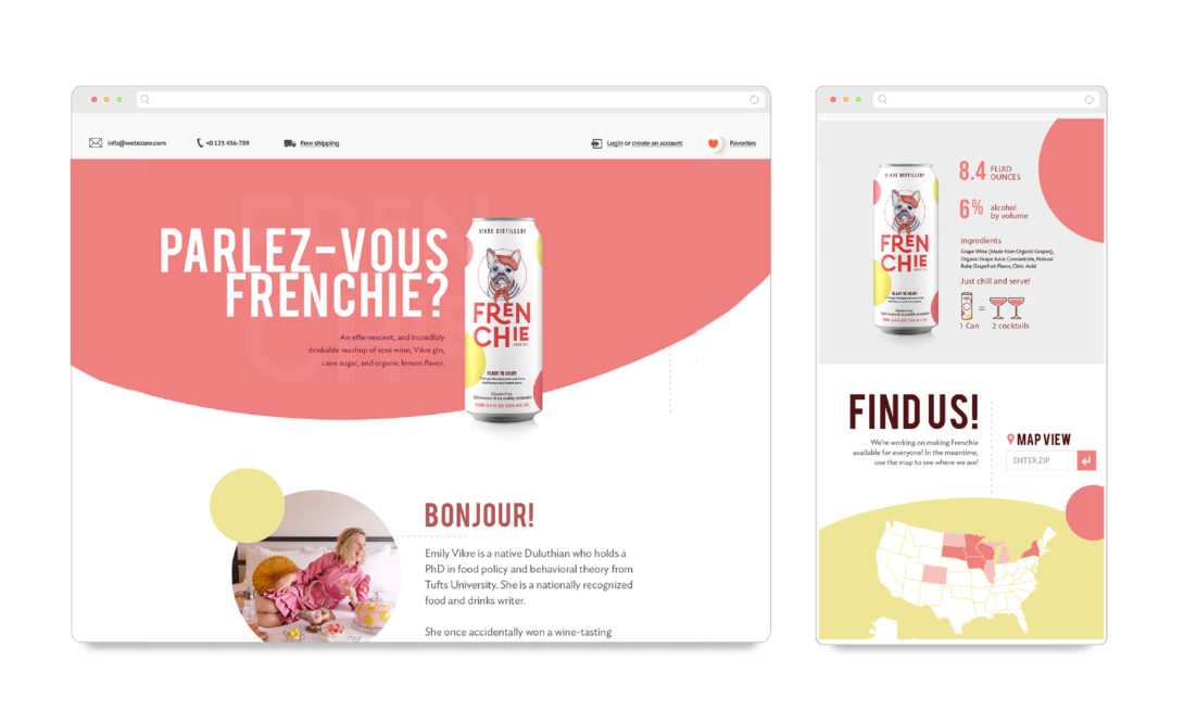
CLIENT BRIEF
Emily and Joel Vikre (Veek-Ruh) have been clients of Šek Design since the beginning. Over the past 4+ years, we’ve had the privilege and pleasure of helping them to design rack cards, brochures, labels, posters and a few other odds and ends for their Duluth-based distillery, Vikre. When they approached me in February of 2018 about designing the packaging for a new canned cocktail, based on a French 75, I was thrilled to have the opportunity to create a unique design that would stand out among the competition. The goal of the overall Frenchie Cocktail brand was to create something feminine and bold while featuring a hand-drawn dog without being too childish. The brand had to be able to expand to packaging, in-store displays, clothing, website and eventually a potential series of canned cocktails. The basis of the brand had to come from the dog drawing itself. We came close to the final look with the polka-dots and ‘Frenchie’ font but the drawing took a lot more time to work out than any other part of the design.
THE DESIGN
Within minutes after the initial phone call with Emily, I jumped on my computer and created the mockup you see below. After hearing her description of the ‘French 75’ canned cocktail, I just had to use the initial energy to ‘sketch’ my reaction. It probably took me 30 minute and 2-3 iterations but I knew there was something there that we could carry through to the final design. The dog sketch was originally something I‘d found online but I knew that I wanted to try a hand-drawn dog in conjunction with polka-dots and a playful, but bold display font. *I’ll often grab an image from Google as a placeholder until I have the time to create the work myself. One of the coolest things with this particular project is that after 15 months of working with the package design on and off, we decided to keep the majority of the original design elements. If you look at our final design (inside), the Frenchie font, the polka-dots, the dog drawing, and the white background have all carried through from the very first concept.
SO. MANY. DOGS.
In order to really nail the design of this brand, we had to discover the true identity of François. Through the use of a wide variety of mediums and styles, we were able to explore multiple variations that finally lead us to the drawing of a dog that fit our criteria perfectly. The final artwork feels whimsical and feminine but remains polished – true to the craft spirit and impeccable ingredients found in this delicious cocktail. The design was based on a loose watercolor drawing that I created while painting with my 2 yr old daughter at home. I found that the combination of a watercolor base with tighter ink over the top could give us the look that we were searching for. The 16 dogs on the left represent some (not all) of the variety of directions that we tried as mock-ups on the can. Sometimes the style was OK, but the dog didn’t look good OR the dog was good but the style wasn’t right. As you can see, even the final drawing went through a stage of digital rendering to bring out the details before finalizing the package design.