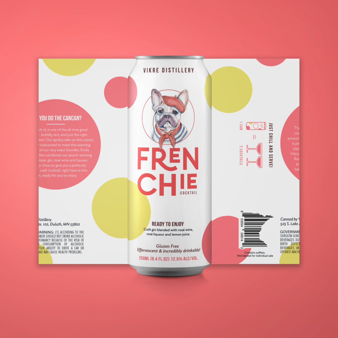
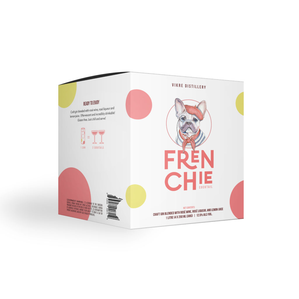
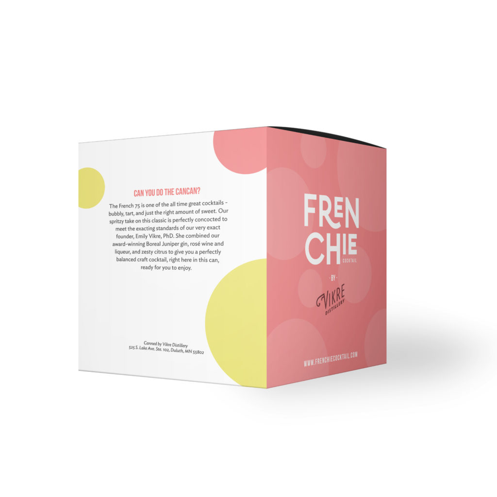
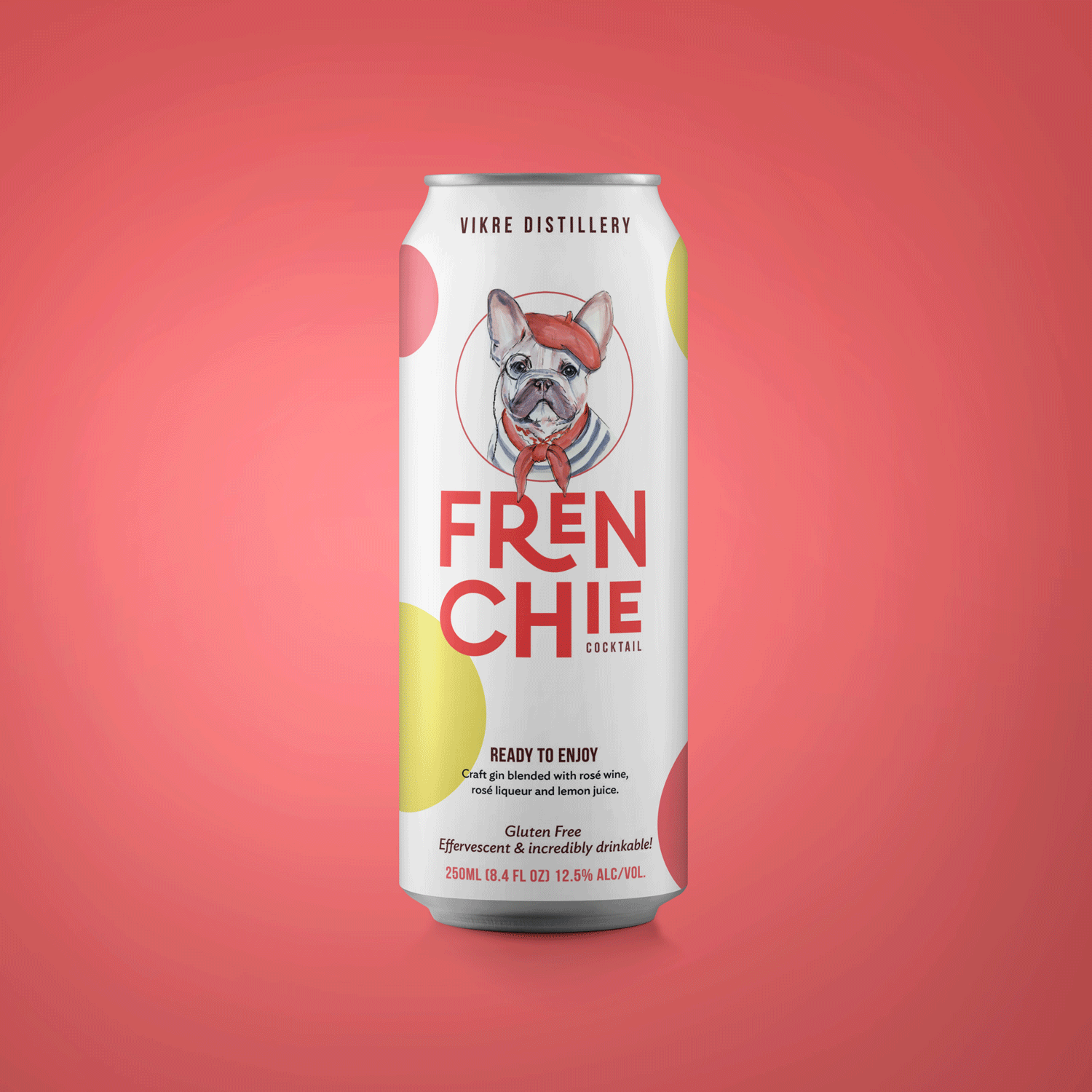
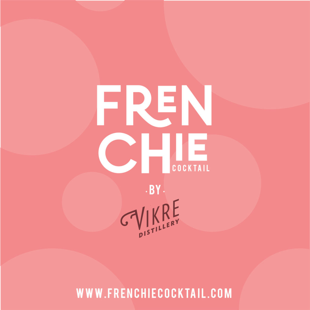
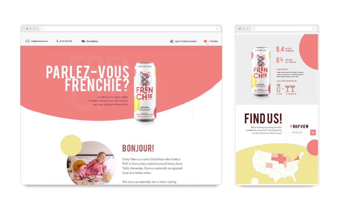
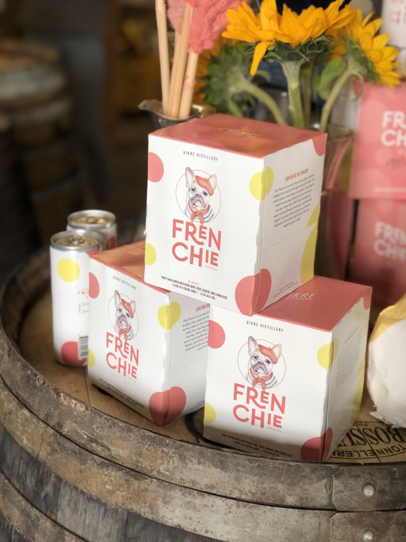
Vikre Distillery | Frenchie Cocktail
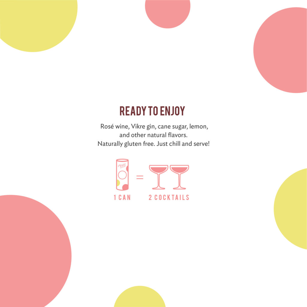
Over the past 4+ years, we’ve had the privilege and pleasure of helping Vikre design rack cards, brochures, labels, posters and a few other odds and ends for the Duluth-based distillery. When they approached us in February of 2018 about designing the packaging for a new canned cocktail, based on a French 75, we was thrilled to have the opportunity to create a unique design that would stand out among the competition.
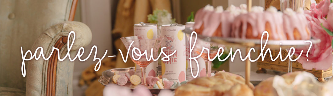
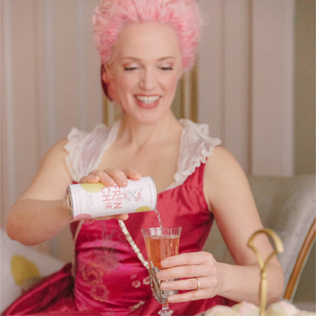
The goal of the overall Frenchie brand was to create something feminine and bold while featuring a hand-drawn dog without being too childish. The brand had to be able to expand to packaging, in-store displays, clothing, website and eventually a potential series of canned cocktails. The basis of the brand had to come from the dog drawing itself. We came close to the final look with the polka-dots and ‘Frenchie’ font but the drawing took a lot more time to work out than any other part of the design. It all came together seamlessly to produce a very fun, and extremely unique, brand and package design.
To see more of a behind the scenes peek at the Frenchie design process, visit our blog.
If you’re interested in making your own packaging jump off the shelves for consumers, let us know. We’d love to hear what makes your product unique.